

 Reply With Quote
awww

I NEED CRITICISM.
and all that.
It's been a mysteriously long time since i've colored anything with colored pencils, something like... 4 years? They've been laying around and i really like the results, of, you know, that one time, so i figured i'd pull them out.
Also, i have no scanner, so my phone's camera is the best way i can currently get these up. It's not quite as clear as it would be otherwise, but i think they look clear enough to get some good criticism from.
Tell me the good, bad, if you think i'll fail in this world... because i'm pulling together some stuff for my portfolio... and half of the "gifts" (the second picture here) i'm making are going to Kinko's for some shifty two-faced hidden agenda of hopefully helping me.
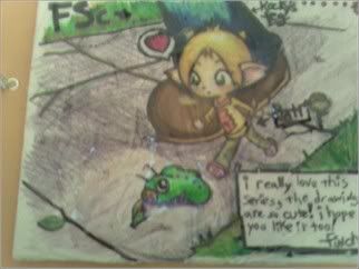
Sent to a friend in Singapore a month ago, and i don't even know if it ever got there. This is all that's left. ;___; Two of my characters, Patri is a tiny little girl and Rocky is a giant. Bonus points if you can guess where the names are from! There was plastic wrapping around it so the colors wouldn't smear in the shipping. That's why the colors are weird.
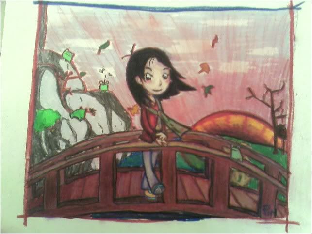
Another gift, this time a year and a half late for a birthday. It's uh, the girl i made it for. She likes self portraits for some reason.
Donk

 An intruder!


awww
 can't wake up


I hope you got some poontang out of these.
Finch likes poontang?
elephant.
Are there scanners at Kinkos? I think the backgrounds are too rough. You should have them all shaded as tightly as the little drawing of Patri appears to be.
 i drink it up!

I like your sense of composition and colour combinations. Rezo is right in that you should spend more time physically rendering your colouring.
Originally Posted by rezo
I can't tell if that means you like it or not... So either thanks, or NO U.
I guess. I don't like the pee pee.
There are color printers at Kinko's. That's all i want.
I didn't even notice how rough the backgrounds were before they were pointed out. You're right, i'll spend hours coloring the character to be just right, and the backgrounds, as much time for a lot more space.
I think these are the first real colored backgrounds i've put any effort into, and i just realised that.
Anyway, thank you very much. I really need stuff like that.
See above, it'd be pointless to type the same thing twice, but i really appreciate it.
Donk
An intruder!
Really, I think they're nice looking. I wasn't aware you were looking for in-depth criticism because of the title and since they're in colored pencil. Your characters look nice, that bridge looks nice, but, like mentioned, the backgrounds are really sloppy.
I'm not really sure what you're planning to do with this portfolio though. You have consistency, so have fun and do a children's book or something.
Thank you, that's exactly what i wanted. I want the nastiest things people could say, but if people like what i do, i'd like to know that too.
I'm glad you said that about the bridge. I wasn't too sure and didn't want to bother people too much.
I hope i'm not seeming too arrogant or demanding or naive. I just want the truth.
I think the colored pencils look nice, but do they have a reputation of being ameteur? I like the result. I know most companies probably want Photoshop, which i know well enough, but haven't used it much at all on my own work.
Some people look for it; children's clothes designers and a few people who want to make a book and need an illustrator. I know a children's book publisher was looking for something i'd fit well recently, but wanted two year's experience, and i'm not confident enough about my own work to try to fake that.I'm not really sure what you're planning to do with this portfolio though. You have consistency, so have fun and do a children's book or something.
Apologies in advance for the livejournal entry.
My teaching job and the other one (not professional) are very unfulfilling. The only way i could advance with the teaching is to get my master's, which i don't feel like i'd be getting for any other reason but that. That's not what i want. It's grinding down to a point where i'm just doing the teaching thing for the money, and that sucks for me and the students. They don't give a shit, but i feel like i should try hard anyway. It just wears me down, so, i'm trying to see if there's anything out there.
My professors told me that no one would hire me for my work, and yeah, i thought that for a while until i had some friends who started pushing me that there are a few things out there that would fit me perfectly. So that's what i'm working for.
Donk
An intruder!
I've had a few, so bear with me, maybe.
Well, if you're pursing it as a more professional thing, I think we need to see more, nicely scanned or something, to judge.
No, there's nothing wrong with colored pencil, and I like its intimacy, but here I don't see you doing anything super-special with the medium. The sunrays in the second picture aren't good, but I know it's because it's hard to do broad things with colored pencil. Maybe you'll want to try mixed medium. with watercolor? (MInd you, I say this because I have a hard on for anything watercolored.)
The enviroments aren't that great, but the people look very nice. I like them. I think you'd want to go more in the style of the second drawing, which is more anime-inspired, as opposed to the first one which is rather plainly anime, or anime knock-offish. I really like the bridge. Very strong, but not smothered with color or detail.
Words I never expected to see.


Bookmarks