
 Reply With Quote
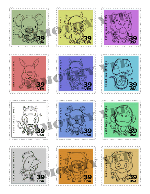
I love the stamps, assuming you drew those. The tiger is adorable.


 Back from the dead!

So here are some of my graphic design pieces for my portfolio class. This class is to pretty much just make whatever pieces to add towards my portfolio. This is my last semester. Let me know what you think. This isnt all of them but I just decided to make a thread.
Excuse the watermarks. It wont be on the actual printout but I put them on the images since I know people from the web will take things (yes, I'm stupid like that).
No time to put watermarks on the last two and this is the only site I posted the last two images. Been working on website for Advertising Production competition and learning how to use Keynote on MAC.
Last edited by bandit; 13 Apr 2006 at 11:43 PM.
 Hey-oh!

I love the stamps, assuming you drew those. The tiger is adorable.
Back from the dead!
I wish I had the time to draw them. They were actually taken off the net. If I find the time, I'll draw them myself.Originally Posted by Nomi
 i drink it up!


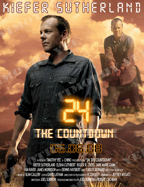
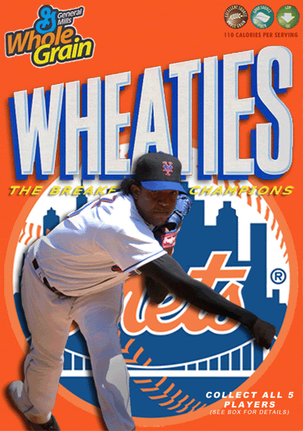
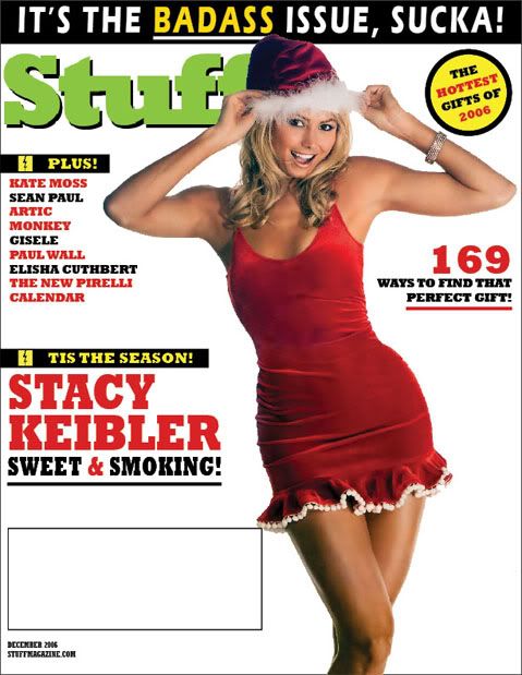
The stamps are by and large your best piece. The magazine covers don't have the gloss most pro level magazines have, so I'd buy a couple of magazines and try to come up with something unique. I think it's the cut outs on the Stuff Magazine and Wheaties boxes that are really hurting them. Try to adjust the lighting and blending modes on them slightly for better results (moreso lighting).
And practice your typography. If you want a job in a high end design position you'll have to tighten it up. Poor typography is a dead giveaway for an amateur.
The stamps are your best because you don't over design them.
Andrew's right about the type. Stretching fonts is a huge no-no. Need a tall font? Find one!
Why the fuck didn't you draw the stamps? Duh! I was going to compliment you on that bit. If you do draw 'em, polish 'em up.
There's a lot of stuff flagging you as ametuer level here. I'll recommend some books to look up if I can remember what they're called.
 CHOKESLAM


I agree with everyone else here, the stamps are definately your best piece up there.
While extremely nitpickey, it was the first thing I noticed on your Stacey Keibler cover, the spacing on the 169 is all off. The 1 is too far left and not spaced proportionally to the rest of the numbers. Just a quick thing you may want to fix
Eat a bag of dicks.
 revenge thriller
i like the wheaties box.

Back from the dead!
Regarding the gloss, I wasnt trying to get the gloss look. Just wanted the layout of the magazine.
I have to fix the Wheaties logo and probably the images. When I print them out, its blurry and a little pixelated.
Ive been told that my typography is weak. Been trying to work on it.
I have a couple of books that I have yet to look at. This last semester has more work then I expected. Professional Portfolio (where majority of these works go to) and Advertising Production (making a brand, website, commercial, marketing and all that stuff for a company).
I plan to draw them once I have the time.
I did put any spaces in the 169 as in using the spacebar. I used the settings from InDesign.
i drink it up!
If you're going to make it look like a magazine you might as well make it look like a magazine, but it's up to you. Definitely watch your type. Like I said above, poor handling of typography is the #1 deterrent for anybody in a high end design studio looking at your portfolio for potential employment.
For example:
This is a logo I'm currently doing for a press. The type I used underneath the logo didn't turn out like that when I turned it down. I played around with different greens and colour combinations with black, grey and assorted greens to get what I have now. I also had to physically kern every letter to make it look proper. I could have just put it down and been done with it, but as a designer you need to focus on details.
I like the idea of making a brand and developing it, it sounds like a fun class to me, although I'm not sure you'd ever be in a position to micro-manage a brand like that in the real world (corporate monkeys always do it for you).I have a couple of books that I have yet to look at. This last semester has more work then I expected. Professional Portfolio (where majority of these works go to) and Advertising Production (making a brand, website, commercial, marketing and all that stuff for a company).
You don't have to physically draw all of the materials you use when it's for school. Like what you have is fine, you're not billing yourself as an illustrator. You'd probably impress people a lot more if you did, though.I plan to draw them once I have the time.
Never trust the default settings for type. You have to look at the lettering and kern wide gaps where necessary. The rule of thumb is that the letters should always be tightly in together but not touching (there are exceptions for certain letter combinations in certain type cuts).I did put any spaces in the 169 as in using the spacebar. I used the settings from InDesign.
To be brutally honest, this looks like the kind of work I was doing in my first semester of the graphic design program I was in (except it had to be by hand, they wouldn't let us touch computers the first year to drill in to our minds that Adobe Photoshop is not design, it's a tool like a pencil). If I had plopped this down in my final portfolio assessment I would be redoing my third year of graphic design right now. You need to make sure you don't just put things down on the layout. You need to think about how they line-up with one another.
Good luck man. I wish all the best to you in this unforgiving field.
Last edited by Drewbacca; 15 Apr 2006 at 11:23 AM.
Back from the dead!
True. I'll keep that in mind.
I see what you're saying. But what could you possible due to the letter to make it proper? Size, width?For example:
This is a logo I'm currently doing for a press. The type I used underneath the logo didn't turn out like that when I turned it down. I played around with different greens and colour combinations with black, grey and assorted greens to get what I have now. I also had to physically kern every letter to make it look proper. I could have just put it down and been done with it, but as a designer you need to focus on details.
Its not a one man project. Its three different departments working on the same project. You have the art department, marketing and business. The competition is the National Student Advertising Competition (NSAC). Each year, companies bid (I guess) and the NSAC chooses that company and all colleges have to make a marketing book, commercials, website and all these other advertising/marketing plans for that companies product. This year its Postal Vault (postalvault.com). Last year was Yahoo! and I think the year before was Toyota. Majority of these companies dont need these advertising ideas as they have their own to do it for them. This competition is pretty much just a tax write off for them. But this is a great experience and a great portfolio piece.I like the idea of making a brand and developing it, it sounds like a fun class to me, although I'm not sure you'd ever be in a position to micro-manage a brand like that in the real world (corporate monkeys always do it for you).
Well, I can draw all them. I got an associates in Illustration. But like you said, I'm not trying to sell myself as an illustrator.You don't have to physically draw all of the materials you use when it's for school. Like what you have is fine, you're not billing yourself as an illustrator. You'd probably impress people a lot more if you did, though.
Any other suggestions for the type?Never trust the default settings for type. You have to look at the lettering and kern wide gaps where necessary. The rule of thumb is that the letters should always be tightly in together but not touching (there are exceptions for certain letter combinations in certain type cuts).
To be brutally honest, this looks like the kind of work I was doing in my first semester of the graphic design program I was in (except it had to be by hand, they wouldn't let us touch computers the first year to drill in to our minds that Adobe Photoshop is not design, it's a tool like a pencil). If I had plopped this down in my final portfolio assessment I would be redoing my third year of graphic design right now. You need to make sure you don't just put things down on the layout. You need to think about how they line-up with one another.. Now I'm afraid to show my work. HAHAHA JK. I appreciate the criticism and opinions. The more the better.
Thanks. Right now I'm looking for internships (as I had a thread on getting some networking and such). Cowdisease helped me out with one and I got the internship. I got an interview with Time Inc. Waiting for hiring manager to interview me. I got another one as well. I sent my resume to TBWA/Chiat/Day (big advertising company). They werent looking for interns so they sent my resume to their other company (they bought out two companies and put them together to form Brand Architecture International). So I have an interview set up this Monday. I prefer either Brand Arch. or Time Inc. It gets my foot in the door and looks good on the resume. But the hookup cow got me is good as well. Gives me a learning experience.Good luck man. I wish all the best to you in this unforgiving field.
 Posting Permissions


Bookmarks