
 Reply With Quote


Nice work. Astro Boy's face looks a little rough though. With a character that stylized, there's a very small margin of error. It being even just a tiny bit off is going to look wrong.


 Roll it up !

Hayya !
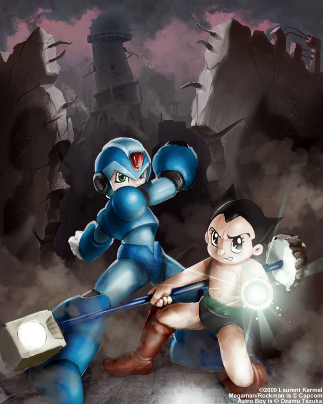
I've just posted a new illustration featuring Rockman - comments and critics are welcome
http://lkermel.deviantart.com/art/Brotherhood-114377391
Nice work. Astro Boy's face looks a little rough though. With a character that stylized, there's a very small margin of error. It being even just a tiny bit off is going to look wrong.
Last edited by YellerDog; 28 Feb 2009 at 02:46 PM.
Originally Posted by Razor Ramon

 robot boy
heh, i thought i was the only guy that liked to draw astro boy and mega man together. wel...i've never done x and astro. the coloring is great. i don't like astro's feet much. and they seem to be a little too close to eachother. it doesn't really look like the top of that lamp post or whatever should be that close to x's leg...or like maybe you tried to make it fit into the picture.
Roll it up !
The fact that I picked X and not Bomberman seems to be what bothers people the most... I thought it had a more angular design that would fit the illustration better but the comments I receive sort of make sense, especially as I featured AstroBoy in the same pic. Oh well...
Rama, you're right about the lamp thingy, I wanted to have something to balance the composition out... maybe I should have gone for something smaller... Astro's feet were a real challenge as they usually are highly stylized and I wanted to have a more realistic look. Maybe I went overboard with them as they now look more 'leathery' than metallic.
YellerDog, what do you mean by rough ? Do you think Astro should have less detail on his face overall ?
Thanks for your comments guys !!!! this is GREATLY appreciated !!!!
Well, it seems like the face is drawn a little out of proportion vs. the traditional 'on-model' Astro Boy look. If you tried making the face more realistic all around (or go full cartoon), you might not have the same issues, but the sort of half-painterly-half-cartoon black outlines thing just isn't coming together at the moment.
 Food alright? Try the wine!
I'm not a practicing artist so technically it all looks good to me, the only thing I would change would be how close the two characters are to each other (they seem kinda cramped).
 Posting Permissions
Bookmarks